Friday 26th April 2024 Initial research
L/O: To investigate production companies and similar products.
Issue 1#
Instantly the style i want to go for.- Genre is obviously rap but it seems to trap/drill rap especially with the background seemingly being the city streets where rappers mostly from these areas would make trap music.
Very much inspired by MF Doom and especially this cover type of rap and type of cover. However im not going to do any type of drawing of the characters but instead mixing the covers of the top with this one.- Intertextual references i could do about MF Doom
Could go for many references about 2000's rap such as many other artist on my cover via cover lines
Although its a group i could go for this style but with just me or perhaps me multiplied doing different poses
Here me out. Content page has multiple artist that create the music avengers of this decade or something i don't know. Mainly inspired by the MF doom song "This is Cannon now" where they are dissing the avengers and just all marvel perhaps the cover can relate to marvel and the contents page and website which can have multiple artist relate and call them "The avengers of music" can be the action of the music magazine.
Issue 2#
- Inspiration/Vibe i'm going for the next issue i'm going for. It can still link to whole avengers theme but i feel like i want to sway away from the rap plus the rap cover won't (Hopefully) take much editing but instead.
Thursday 2nd May 2024
Silverback publishing
At Silverback, we understand the importance of literature written by experts which readers can trust and rely upon. Our publications always aim to deliver high quality content provided by experts in their field and range from novel-style books to academic monographs.
-They focus on. multitude of genres such as indie rock, R&B , Jazz, pop and much more.
- set up 2013
- We believe in print; it is non-distracting and engages the reader directly, but we also recognise the need to read our lovingly designed publications digitally, and that’s why we have collaborated with some of the leading online magazine platforms and digital newsstands such as Pocketmags, Readly and Active Editions. Now all of our titles can be read anywhere in the world instantly.
The colour palette is muted, monochrome look even the artist is black and white. Only colour shown in the cover is the "Black pulp fiction" and the main coverline "Slick rick"
The fact his name Slick Rick is coated in a glossy gold such riches and wealth as the colour gold connotes the idea of riches and success.
The intertextual reference of the movie pulp fiction which was a part of crime thriller genre and calling it black pulp fiction suggest slick rick's life is like the film pulp fiction, and also associating his gangsta life and his history of crime and how his antics with others can be seen as rather violent and criminal. In addition, Having it titled "Black pulp fiction: The first Gangster rapper" suggest his life is like a movie.
Calling Slick Rick the first "gangsta rappers" suggest his songs and his lyrics are all legit and real which adds to layer of respect the rap industry have for him and his group.
Back to the colour palette being monochrome and with cover lines such as "The inside story of the ruler behind bars" makes it feel like an article on a newspaper and this is one of the main stories.
Audience would want to read on to understand Slick rick's music as well as his life and story since the magazine insinuates to explore his criminal past and how interesting he is and with many of the lexis suggest his legitimise his actions and songs.
During this period of time with trap rap the more violent the rap is with songs the more popular is is as people were praised for talking about their life and the violence they cause as well as throwing shade at other rappers and keeping stuff real keeping their reputation alive and to be known in the streets.
It seems quite high production value having the artist involved and with how successful he was it seems that getting a shoot with him would quite expensive. Showing that the source are passionate about the artist and his story that he has for the reader.
- With the contents page we see that the artist "Ice cube" is the main vehicle is still prominent however the contents page does take up most of his face. His face being very clear will entice the reader into wanting to continue with the magazine as with ice cube being the main i age insinuate he will be the main focus.
The layout is quite simplistic and easy to read for the audience. Having the contents of the magazine on the Right side whilst on the left side has prominently the star vehicle with the magazine name in the bottom left.
The font is kept the same the subtitles are all bold sans serif font to be really clear to the audience what they will see and underneath the headings is a less bold serif font giving slight information on what the source will talk about with the topics.
Overall the design is sleak and clean and with a slight taste of modern to it due to the the colour palette being quite simple and the writing being easy to read it feels like im reading a restaurant menu picking what i want to order but for the magazine.
Genre 2
This cover is very artistic compared to the other cover
we see here the colour palette here is vibrant, saturated, full of colour and passion. However, due to the style they went for it makes the cover seem like it had a lower production value compared to the other magazine even with the main star vehicle being the actual artist the budget may seem low. Although, it may seem low it is mainly just how the artist does her style and rather than it being low budget it seems to be more of accurate representation of her work and art replicated for the cover than it being a low budget cover.
Every font is slightly different in their own way on the cover: the masthead is sans serif bold font with a slight use of serif font, the main coverline is a also a sans serif font yet small and feels more hand wrote, And the artist name is full on bold text with is only unique font with what feels like it has being sown onto the cover. With all of these being unique yet similar in her own way express the artist creativity and uniques to other artist and how passionate to her work.
With this you can tell most stuff is hand draw mainly to show the artist creativity and enthusiasm with her art and perhaps to show more of her personality to the reader. Although they are kid drawings it shows that her music might feel playful and energetic which is a change for most modern age music.
The overall style of the cover feels very comic like almost like she's in a sketchbook also connoting the idea of creativity and how she is very passion on perfecting her music and consistently making stuff she is passionate about.
The coverline here suggets that she is above a lot of people however doesn't seem so cocky rather that she's very unique and shines better compared to other people and in their life.
Although she is in black and white rather than it connoting possible meanings of sadness its more of a contrast to the art around her and how it suggest more of her creativity and how it spurs around her.
This cover takes inspiration from her own album covers which show similar artistic traits. To some they seem lazy or unprofessional, however its her style that she's fond of and perhaps its more focused on her songs then the cover. Many artist have simplistic or strange covers but the music completely juxtaposes the cover and adds a nice feeling to the songs with the albums. Beabadoobee has the same effect and this cover cleverly takes inspiration of her art so fans of her will recognise that the magazine cares for the artist and want the reader to really understand her and her work.
This magazine cover mainly takes inspiration from this album cover of Beabadobee know as "Beatopia" her second studio album released on the 15th of July 2022
Although the magazine cover has more recognisable features this one doesn't really have as many and seems like random scribbles on a piece of paper. However the similarities in art styles is very prominent and shows her creativity in a different way to how most people would normally envision. The magazine cover having this art style shows they are passionate talking about the artist and using a recognisable cover rather than just a simple photoshoot of the artist.
More examples of Beabadoobee's creativity where its a lot of hand drawn images and her being involved in separating her from the art almost like her whole reality around her seems fictional and full of creativity. Some of these covers seem rather random and not well made however, its what separates her from other artist as she shows off her other skills and her vision to the audience which intrigues them and makes them want to look further into her and see what she really is about

One thing that is very noticable is that there is no sign of the logo nor masthead on the contents page perhaps meaning that the y are more fixated on the artist they talk about rather than themselves.
Yet again rather simplistic with the layout. Having a list of artist covered and what page you can find them on the top left. With an image of one of the bands "Wallows" covered on the right with their page number on the top right
The full bottom half is the band "neighbourhood" and their page number where you can find them.
With the Neighbourhood taking up most of the magazine makes it seem that these guys may of been on the front cover and is an artist that pulls in the attention and make the reader want to read their section
same effect applies to wallows although they have a smaller image they still are prominent on the cover page so also wanting the reader to read their page.
The colour palette is very simply being mostly white and mixing with a calming lavender and purple. This simplistic approach feels rather cozy and makes the reader feel like the read will be enjoy and casual compared ro other magazines which have either a harder or artistic approach to the contents page or just plain white. This contents page is interesting yet not boring.
Friday 10th May 2024 Website research
The Source Website
https://thesource.com/
As we can see the main front page is focused on their "Video of the week" Which are split into 4 different videos about popular artist and news on them.
This can appeal to certain fans of their music so they get to catch up on news and information on their artist, have an inside view on how the artist creates music and its also a gateway for source readers to get interest in different artist that are similar to genres they like.
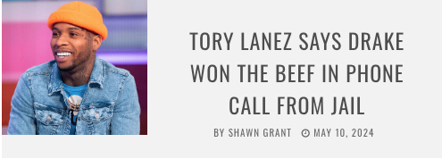
people feature were the names of DDG, Lil Baby, Drake and 21 Savage.
As we can see the layout has the masthead right at the top with a main video playing centre of the page with 4 other videos paused on the right side in an organised matter, with the menu button being in the type right with the classic source red very noticeable to the reader.
These two screenshots display how the rest of the home page looks like. A huge blob of text which contains the box texts but in a much tiny font. This text isn't exactly eye catching even though it takes up a sizeable amount of the layout but due to how summarised the info is due to it being the box text but smaller its quite a quick and easy read so it isn't a huge bother for the reader
What takes the main section is modules containing an image a box text, a by line, and date line When clicking on the image it takes you to separate blog exploring the story in further detail. With more links to social media and even quoting them with their statements. This appeals to the younger audiences that use these social media sites such as twitter and instagram and actually are interest in these topics. Even having interactions at the end for audience to feel a part of the story and show their appreciation for the website.
Promoting their other services showing that they adapt to their audience and spread their news the many ways such as traditional magazines, the website and a podcast. Allowing the audience to also listen to their views on things and keep in touch with their music needs and information.
Also very accessible to everyone with different apps to install it.
More ways to interact with the source and for the reader to feel valued as you can send it to many social media websites including those that are popular with different generations.
The box texts which are also clickable these are the more common ones that go throughout the homepage.
As we cam see the Tab layout has the Masthead on the top and the logo on the right.
The font style stays the same as every font is always sans serif everywhere with no changes apart from the by line and date line
The same goes for all their other tabs such as Entertainment, Music culture, Style and source sports.
This simplistic design is easy fro readers to read and indulge in their content and with their simple colour palette you can
tell it is the source as every section the involves the red colour is about the source and usually involves their logo.
As i can see on this new tab you can see it focuses on female news which can be in the in the main section but mainly focuses on all women.
The colour palette has changed to fit the more feminine vibe. although stereotypical with the pink colours. As the use of pink connoting the ideas of feminity through the website makes it feel as an easy way to show the audiences the stories and information they get will read.
Text boxes are also now in pink.
Websites #2 Coup de main
Coup de main has a more unique layout for the website. It isn't unorganised and is very visible to the audience however, doesn't follow the traditional layout of a website. The logo/masthead isn't right at the top and is instead near the top right with a little definition of the name with although is a literal definition of the word 'CoupDeMain' its definition can also be used as a way for the reader to expecting surprising new news on their favourite artist that is unexpected.
We can see a new announcement of an album as the main head on top of the website. The most important news is on the left involving famous and well known artist Taylor Swift. On the opposite we see a smaller phot which you can scroll past and see several pictures with mini summarised stories in a text box. Saying "most recent" insinuating more information and new stories about the certain artist is available.
The colour palette is quite simplistic being just pink, white, black with a slight hint of grey. The pink adds quite a flair to the website however i don't believe it connotes directly to feminity but more of a caring idea its calm and casual for the readers easing them in.
As we can see when you scroll down you can always see the branding of Coup De Main at the top with a typer writer esc font in top right top right which have clickable links that will take you to their playlist with recommended songs with artist they cover in their magazines and websites as well as just in genral popularity that fit their genre of music they cover. This for the audience feels more welcoming and will allow them to diverse they taste and listen to artist similar to their favourites adding more interaction for the audience with the website.
The layout is clean and organised showing a photo directly relating to the topic with no text box but a summary of the the story that will cover. The Typography is a casual sans font adding to the casualness of the website.
On the right we see they advertising their new magazine available for pre-order which more people who enjoy the artist will explore coup de main and more about them. This website shows unique and interesting news and also fall under similar/the same genre
They also cover popular movie topics also diversifying their website and audience as even people who are interested in movie/Tv can interact with the website.
Another way the website allows artist to interact is their own custom playlist which can be listen to on Spotify as well as Apple music two popular music platforms. These normally cover artist that audience will have seen covered on the website and artist that fall under the same genres.
This is where Coup De Main advertise their magazine covers for the audience to buy giving a description of the content and even offer exclusives meaning more for audience when they buy it more value for them.